In the rapidly evolving digital world, optimizing user experience has emerged as a top priority for successful business. Providing positive experiences for users on your app or web is crucial to keep them loyal to your brand. The choices you make in your digital product’s design can significantly impact user engagement and satisfaction. One prominent design trend that has garnered attention in recent years is the implementation of dark mode. In this article we’ll help you decide when dark mode is good for your product and provide five useful dark mode design tips.
When To Use Dark Mode?
Dark mode’s sophisticated, elegant, and visually impactful appearance has captured the imagination of users worldwide, making it a distinctive and compelling aesthetic choice. However, as with any design decision, its suitability depends on various factors. Here are some scenarios when it’s a good choice to use a dark mode theme:
Visual-intensive platforms
Dark UI excels in platforms that predominantly emphasize visuals and images over textual content. Its high contrast enhances the visual impact of graphics, creating an immersive experience for users. This design approach is particularly effective for platforms like portfolios, photography apps, and entertainment hubs. They can also be a great choice for dashboards and visualization tools.
Nighttime use
Dark mode truly shines when tailored for applications designed for nocturnal usage. By substantially reducing eye fatigue and enhancing user comfort, it has become an invaluable asset for applications catering to evening or nighttime usage scenarios.
Younger generations
Dark mode’s allure resonates deeply with younger demographics, while older users may gravitate towards the familiarity of a light-themed interface.
Sleek brand alignment
If your brand’s color palette naturally complements dark mode aesthetics, seamlessly embracing it will align with your design language. Dark mode is particularly suitable for brands that prioritize luxury, prestige, minimalism, or mystery.
The Light vs. Dark Mode Dilemma
The decision to adopt dark mode should be rooted in your product’s intended purpose, target audience, and design objectives. It’s good to check this list if you’re unsure whether to use light or dark mode.
Consider dark mode when:
- Your site is more image and video than text based.
- Users frequently interact with your product, particularly during evening hours.
- Your target audience primarily comprises younger users.
- You seek to create a captivating and stylish visual impact.
Consider light mode when:
- Your user demographic includes older individuals.
- Your product is designed for daytime usage.
- Users are expected to engage with your platform for shorter durations.
- Your content predominantly consists of text and necessitates easy readability.
What about offering users both options?
While branding constraints might limit flexibility, offering both options empowers users to personalize their experience. By presenting both light and dark mode options as default choices, you provide users with autonomy over their preferred visual experience.
HOWEVER, sometimes you eventually have to stick to one mode, for example if you’re building something similar as a movie-watching app (e.g., Netflix) where you don’t want the UI to distract the users from the viewing experience.
Still not sure and need advice? You can always contact us for free consultation.
Implementing dark mode effectively demands a careful balance between aesthetics and usability. While it promises advantages like heightened focus, improved text legibility, and reduced eye strain, it requires meticulous execution. )
5 Dark Mode Design Tips
1. Ditching pure black
Choose dark grays instead of pure black for default surface colors to minimize contrast strain. Google’s material design theme recommends the color #121212..
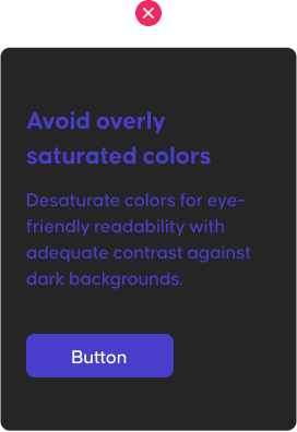
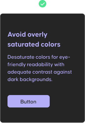
2. Moderate saturation
Desaturate colors for eye-friendly readability with adequate contrast against dark backgrounds. Aim for approximately 20 points lower saturation on dark mode compared to light mode.
3. Communicate depth
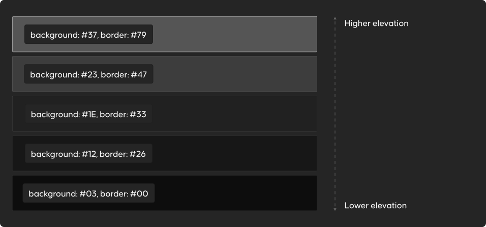
In the world of designing light user interfaces, shadows play a role in giving elements a sense of depth and elevation. However, things get a bit trickier with dark backgrounds in dark UIs – shadows tend to be less visible. To bring depth to a dark UI, a smart strategy involves incorporating various shades of dark colors.
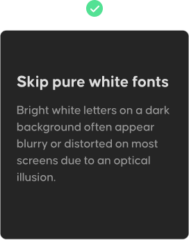
4. Avoid pure white fonts
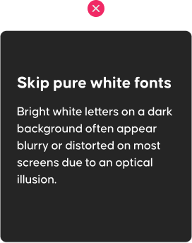
Same as pure black isn’t ideal for a dark theme, bright white text can glow too much in a dark UI, creating a jarring effect. Use a slightly darker shade of white to soothe the eye.
5. Balancing negative space
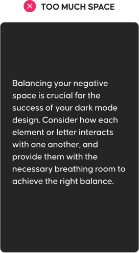
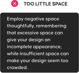
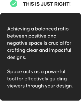
Harmonizing negative space is a vital aspect of creating successful dark mode designs. Finding the right equilibrium is key – too much space can leave your design feeling incomplete, while too little can lead to a cluttered appearance. When allocating space, consider how each element interacts and provide precise breathing room to maintain a harmonious layout.
Come to the Dark Mode Side
By embracing the potential of dark mode and mastering its implementation, you can elevate your digital product’s aesthetics and usability, ultimately leaving a lasting and positive impression on your users. But remember, the decision to adopt dark mode should be driven by your product’s purpose and audience, and offering both options can empower users to tailor their experience.


