From an idea to a 12,000-user reality in 14 days.
Kodius delivers outstanding value without compromising on creativity or professionalism. Their designs were top-tier, yet their pricing was incredibly competitive — I’ve worked with agencies that would have charged three times as much for the same level of work.
The Challenge
Bridging the gap between a brand book and a pitch.
The founder of The Passive App had a clear mission: use AI to automate the soul-crushing part of job hunting. The backend logic was there, and the branding was defined, but the product lacked a tangible interface. To secure funding and attract early adopters, the platform needed more than just a functional backend — it needed a user experience that felt intuitive, trustworthy, and modern.
In a market dominated by corporate giants like LinkedIn, there was no room for a “generic” job board. The risk was twofold: failing to differentiate the product visually, and losing the trust of users who might find an automated AI “HR manager” too impersonal or opaque. The clock was also ticking — a high-fidelity prototype was required for upcoming investor presentations.
-
No room for a generic job board
In a market dominated by LinkedIn and other corporate giants, the product had to differentiate visually — not look like another listings site.
-
AI that didn’t feel impersonal
Users had to trust an automated AI “HR manager”. If the experience felt cold or opaque, early adopters would walk.
-
A ticking investor deadline
A high-fidelity prototype was required for upcoming investor presentations — measured in weeks, not months.
-
A non-technical founder
The roadmap had to be built around the founder’s HR expertise, with a transparent process that kept him in control of every decision.
One workshop, two weeks, one investor-ready prototype.
Transparent communication, iterative design, and high-value execution for a non-technical founder — from a 1-day workshop to a final handoff in 2 weeks.
The Transformation
From 1-day workshop to 2-week handoff.
The process began with a deep-dive workshop to align the product’s roadmap with the founder’s HR expertise. The goal was to move away from the “corporate fatigue” of traditional job sites and toward a more engaging, social-media-inspired flow. Efficiency was driven by a near-instant feedback loop: regular Figma reviews allowed for real-time iterations, moving from a bare-bones menu to a high-fidelity prototype in just two weeks.
- Day 01
Workshop
A deep-dive discovery workshop aligned the roadmap with the founder’s HR expertise and reframed the product away from “corporate fatigue” toward a social-media-inspired flow.
- Day 04
Bare-bones menu
The information architecture landed first — a bare-bones menu the founder could react to before the visual layer went on top.
- Day 09
Iteration
Regular Figma reviews kept the feedback loop near-instant. As onboarding grew more complex than planned, the team kept the barrier to entry low so account creation still felt effortless.
- Day 14
Handoff
A high-fidelity prototype shipped — the level of presentation needed to kickstart fundraising and build out an internal team.
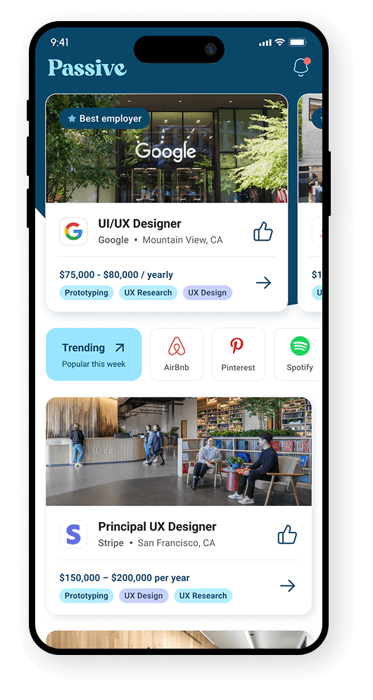
The “Instagram for jobs” concept
One job per card. Fit % inline. One-tap apply.
We reframed the recruiting experience as a “social feed for opportunities” — single-job cards a user could swipe through, with AI-curated fit, transparent matching, and a tap-to-apply flow that made job hunting feel passive instead of exhausting.
- One job per card — no infinite list of links.
- AI fit percentage shown inline, not buried in filters.
- One-tap apply — résumé and profile already in context.
Solving the “AI trust” problem
Two design decisions that made AI feel safe to use.
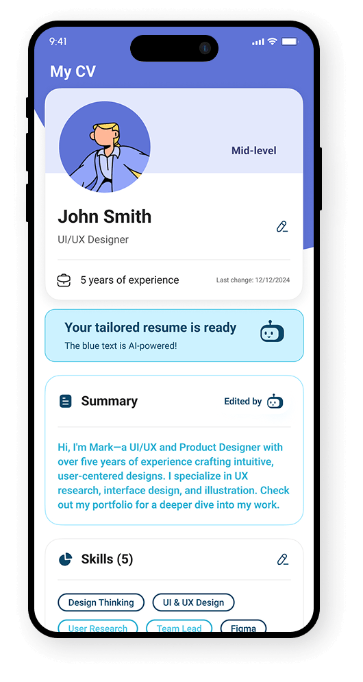
A major hurdle was making the AI-driven CV customization feel transparent. Two specific design choices solved this — letting users see what the AI changed, and giving the technology a human face.
-
Visual transparency
A “Review Phase” was integrated into the application flow, so users see exactly what the AI changed in their CV for a specific job — AI-edited lines are highlighted in blue, side-by-side with the original.
-
A human face for technology
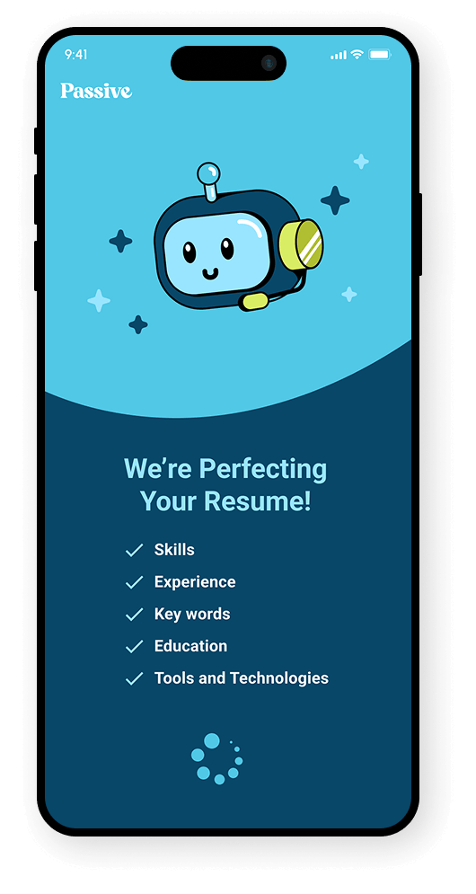
To move away from a “cold” digital feel, a friendly robot avatar — inspired by the existing brand illustrations — guides users through the premium upgrade steps and the resume perfecting flow.
Managing evolving scope
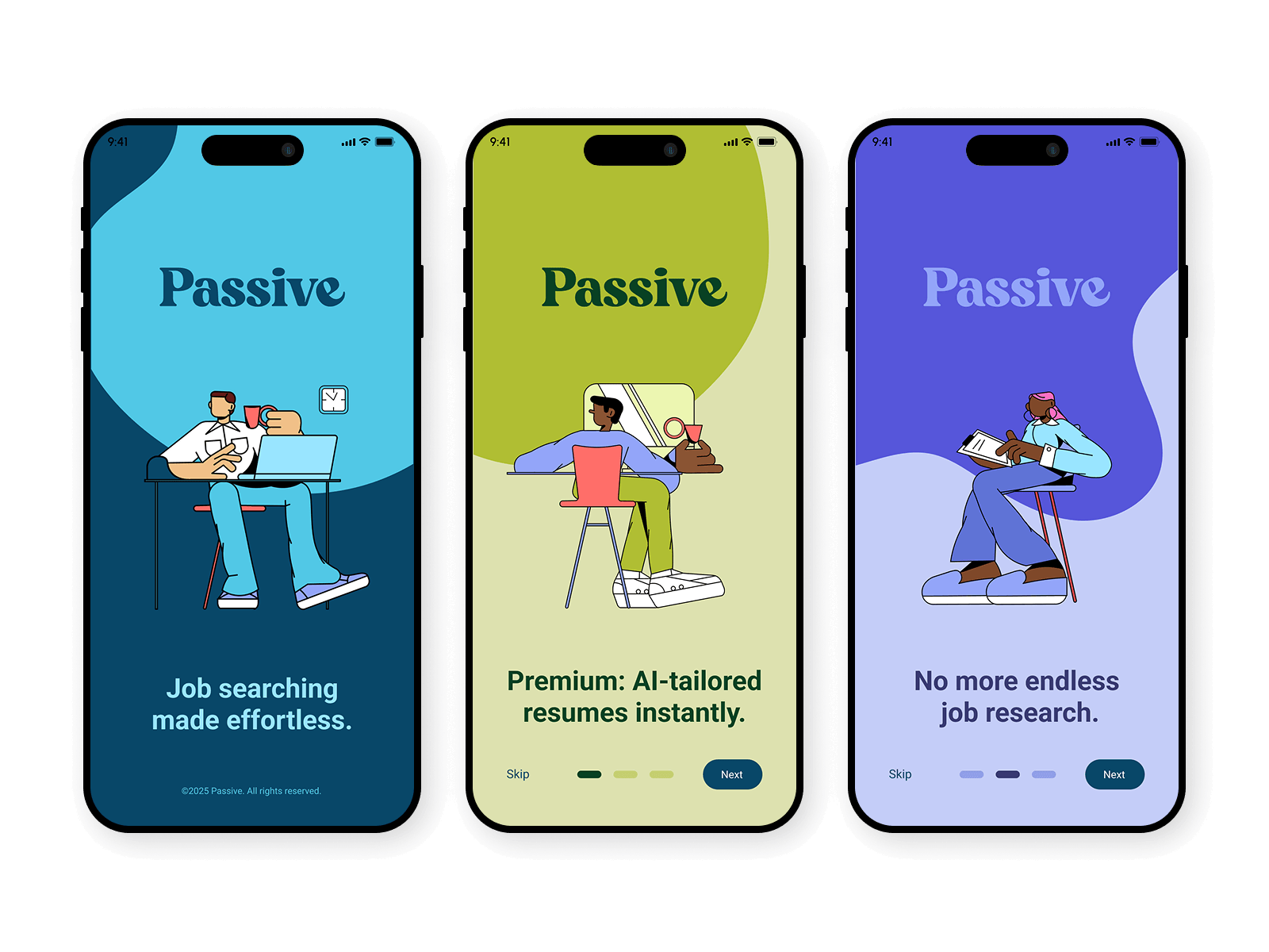
An onboarding that felt effortless, not like a chore.
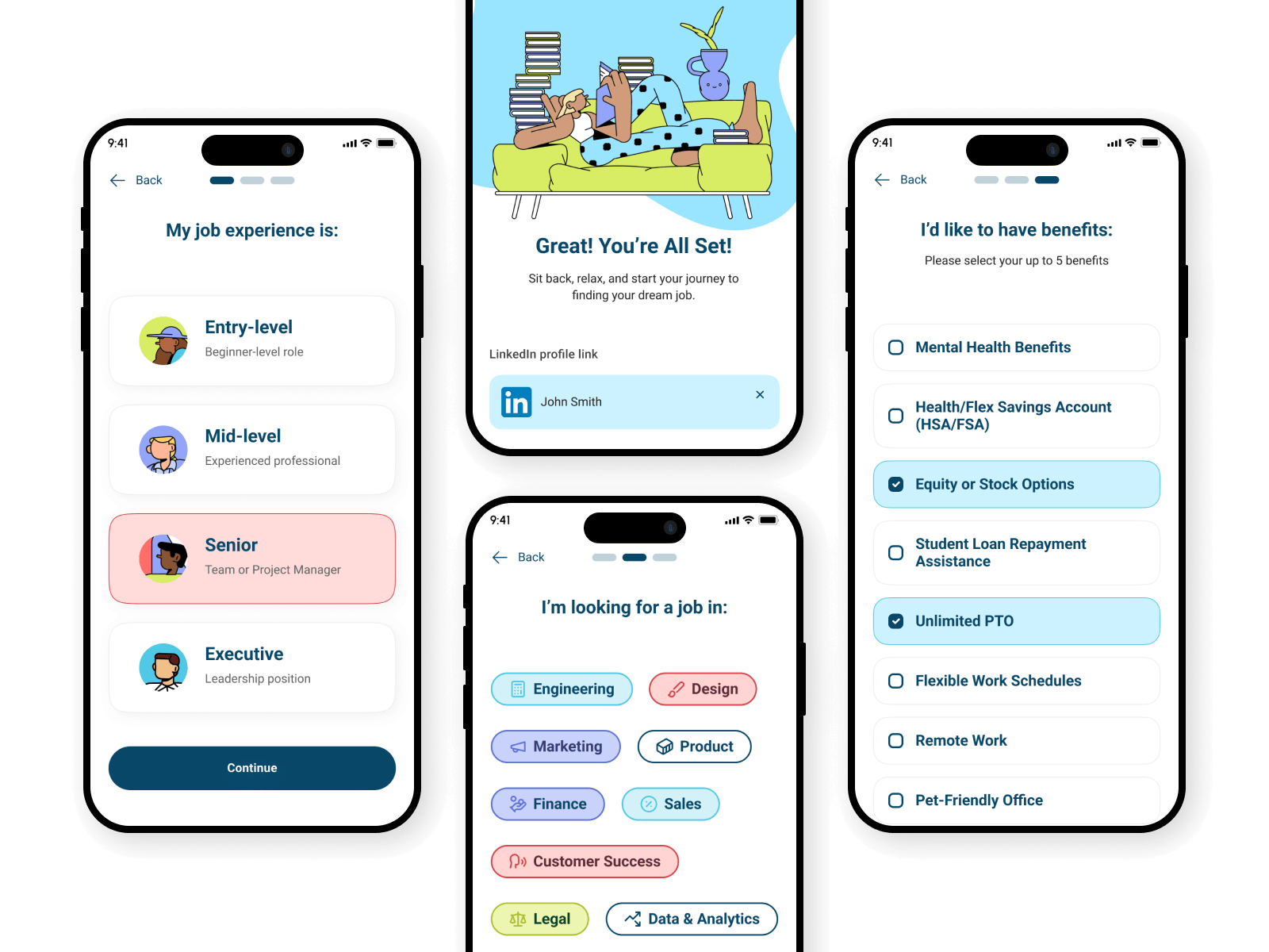
As the onboarding process became more complex than originally envisioned, the focus remained on keeping the barrier to entry low — making account creation feel effortless rather than a chore.
See it live — and read the full verified review.
You need to build your product from scratch.
Other clients we’ve helped through the same trigger.
Optilogic (Cosmic Frog)
A supply-chain product vision with no team to build it. Kodius and Optilogic built Cosmic Frog from the ground up as one team — the only cloud-native supply-chain design tool combining optimization, simulation and a risk engine — and Optilogic raised $50M.
Read the Optilogic (Cosmic Frog) case study →Poplin
An idea for a pre-pregnancy wellness companion, built from scratch into a product couples use across the U.S. The greenfield healthtech build came via word of mouth and earned a 5.0★ Clutch review.
Read the Poplin case study →Machine Desk
A cloud-based project and task management tool for CNC shop floors, built from scratch. Kodius set the architecture and continued development alongside Worcon’s in-house team.
Read the Machine Desk case study →Talks and Folks
A corporate-HR mentorship platform whose growth had stalled on technical limits. Kodius built the MVP that lifted the ceiling — automated mentor and mentee pairing, materials distribution, and progress overview.
Read the Talks and Folks case study →Hangar Studio
A brand and marketing site built from scratch for a Zagreb filming studio with the only original airplane set in the region — strengthening market credibility and making client communication easier.
Read the Hangar Studio case study →